Is There Ever a Time Accessibility Shouldn't Be Considered in Design?
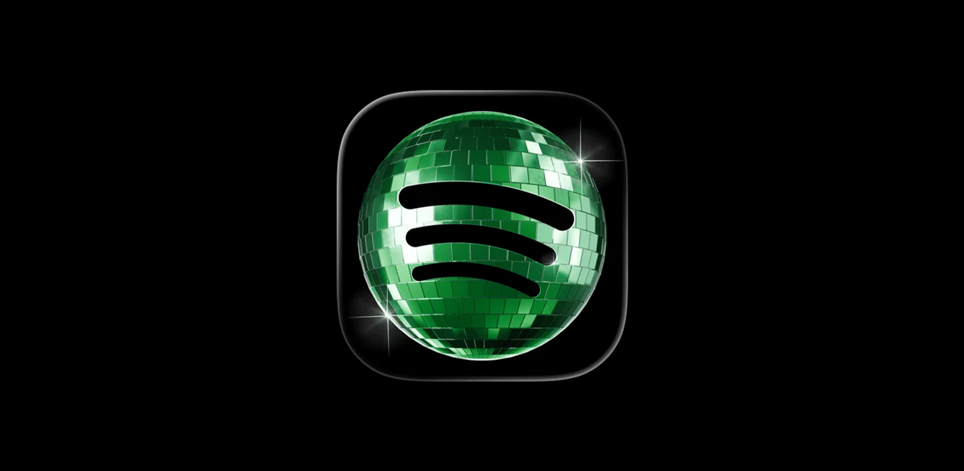
A new (and temporary) logo has us asking: in 2026, is there ever a moment where accessibility just isn't a consideration?
Spotify's got a new logo. A temporary one. And predictably, everyone's talking about it, which is half the point of a rebrand, even a brief one.
The criticism, though, hasn't really been about taste. It's been about accessibility. Different kind of problem, and one worth chewing on.
Key points:
- Accessibility in design isn't new: reaching the people who need to read your work has always been the job. WCAG guidelines have existed since 1999.
- Spotify's temporary logo drew criticism not on taste but on accessibility: darker and lower-contrast, it's harder to read for low-vision and colour-blind users.
- It's an industry-wide gap: a Printful study scored major logos (Microsoft, Dunkin', Walker's) poorly on contrast, and fashion's hairline type routinely sacrifices legibility.
- Give users a choice, like Duolingo's opt-in icon: no one's experience is degraded, and the brand gets real data on whether people want the change.
- The answer is no: there's never a moment accessibility shouldn't be on the table. Most wins are small (stronger contrast, better type) and make design better, not worse.
This isn't new
Designing for the people who need to read your work has always been the job. Before everything went digital, it came down to good judgement and a bit of experience. If your audience couldn't read the thing, you'd failed. Simple.
What's changed is how measurable it all is now. The Web Content Accessibility Guidelines (WCAG) have been around since 1999.
WCAG 2.0 landed in 2008. The 2018 update brought specific criteria for mobile, low vision and cognitive disabilities. Figma has contrast checkers baked in. The reality is that the benchmarks aren't a secret.
So when a brand the size of Spotify ships something that misses on contrast, it's not because the rules weren't clear.
Back to the logo
The icon people know is bright green, high contrast, instantly readable. The new version is darker, muddier, lower in contrast. A few of us in the studio didn't even clock it had changed at first. Someone else thought it was still loading.
Yes, it's temporary. Yes, it's playful. We get it. But "it's not that deep" stops being a defence the moment the change makes the product harder to use for people with low vision or colour blindness. Even for a fortnight.
It's not just Spotify
A Printful study ranked 44 major brand logos against accessibility criteria, and some of the worst offenders weren't obscure ones. Walker's. Dunkin' Donuts. Microsoft. (Yes, that Microsoft.)
Their assessment of the Microsoft logo: a contrast ratio of 1.87, a legibility score of 5.4, a colour accessibility score of 7.6. Not great numbers for a company sat at the front of the inclusive tech conversation. The logo was last refreshed in 2012, before WCAG 2.1 sharpened the focus on low vision and cognitive needs. Refreshes are expensive and risky – fair enough. Still a striking gap.
A small idea Spotify could nick from elsewhere recently stood out to us. Duolingo refreshes its app icon, you get a choice on opening the app. New one? Keep the old? Up to you. Two wins there. First, no one's experience gets degraded against their will. Second, Spotify would get actual data on how many people wanted the change. Which beats guessing.
Fashion's a whole other story. The industry's love of hairline serifs and skeleton-thin sans-serifs has produced a generation of brand work that's barely legible to anyone who isn't squinting under perfect studio lighting. Whether that's deliberate gatekeeping or just inherited convention, the effect's the same. Exclusion.
The short answer
No. There isn't a situation in design today where accessibility shouldn't be on the table.
That doesn't mean every choice has to dilute the work. Most accessibility wins are small. Stronger contrast. Better-weighted type. A bit more breathing room. Things that make design better, not worse.
Brands chasing longevity need to bake this in from day one. Not as a checkbox at the end. Not as the thing you waive for the "fun" projects. Because this isn’t just about compliance. It’s about making sure everyone can experience your brand properly.
If you're keen to chat more about accessibility, get in touch.