Copy in Design: Why Words Matter
Design catches eyes, but words capture minds. Here's why language deserves equal billing.
Key points:
- Copy deserves equal billing with design. Design catches the eye and words hold attention, and together they make the experience greater than the sum of its parts.
- Brand ideation often begins with language. Many iconic identities started with a word, a phrase or a belief before any colour palette existed.
- First Direct built an award-winning brand on tone of voice while rivals leaned on corporate design. It out-communicated the competition through verbal identity alone.
- In digital, copy is UX and clarity is conversion. A beautifully coded site still fails if it doesn't say the right thing to the right person at the right moment.
- Great creative distils rather than decorates. The Foundation Home Loans campaign grew from one idea, "Solution Found", which then shaped the whole visual and verbal identity.
Design often gets the limelight. Colour theory, moodboards, UI grids. It’s not surprising. It's the first impression. It’s supposed to grab your attention.
What does it look like?
How does it make you feel?
These are the questions often asked in the design studios of creative agencies. But what instructs these questions, and what informs them?
Ideas. Stories. Language.
In a well-executed campaign, these are all inextricably linked. It’s an idea that instructs them, that forms the foundation from which a message is created, and a design that follows.
Copy isn’t the tailpiece to design
Copy shouldn't get lost in a sea of visuals.
It’s not there just to fill up space in the design sandwich. Copy is an integral part of design. Good copy provides the verbal narrative for the design’s visual storytelling; both a reciprocal and complementary elevation of the overall experience.
Design must catch your eye. Words must make you stay.
The goal should almost invariably be a relationship of harmony and balance. Each element of the experience supports the other. Altogether, the result is greater than the sum of its parts.
Brand ideation begins with language
As Creative Review argues in its piece on copywriting’s role in branding, many of the most iconic brand identities didn’t start with design, they started with verbal thinking. More often than not, the first spark of a brand isn’t a colour palette. It’s a word. A phrase. A belief. Language.
Take First Direct.
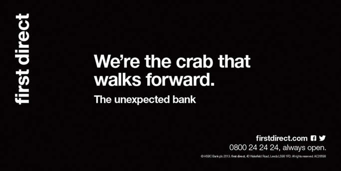
An award-winning brand, beginning as a telephone-only bank (1989), that has long understood the value of saying things differently. The visual identity has no frills. Their personality lives in their verbal identity. It’s clever, conversational, and instantly recognisable.
While most banks reach for colour psychology and corporate design templates, First Direct doubled down on tone of voice. And it worked. They haven’t won awards because they out-designed their competitors – they’ve won because they out-communicated them. And that is what true brand ideation looks like: words that carry weight, followed by design that gives them form.
It’s a reminder that when the voice is that good, copy can carry a brand, and sometimes should.
Why both matter in the digital space
In digital, copy is UX, and clarity is conversion.
You can have a beautifully coded site with slick transitions and bold gradients. But if it doesn’t say the right thing to the right person at the right moment, what’s the point?
We considered this in our brand campaign with Foundation Home Loans and found a solution. The creative brief wasn't driven by visuals. It was driven by a concept. An idea. A “Solution Found”. And from that very bit of language, a visual and verbal identity emerged. The core ideas were honed through language, giving the design system something solid to work from, which extended into their website and digital advertising.
That’s the difference when you work with a creative agency that leads with ideas. Great creative design shouldn't just decorate; it should distil.
Look good. Say something better.
Good design gets you seen. Good copy gets you understood. It’s that simple.
Whether it’s a homepage, a campaign, or a brand identity, the goal remains the same: create something that resonates. Not just to be looked at, but to be remembered, understood, and acted on.
It’s the harmony between words and visuals that makes a brand feel like more than just a logo. It makes it mean something.
Looking for a creative agency partner for your brand? Get in touch.